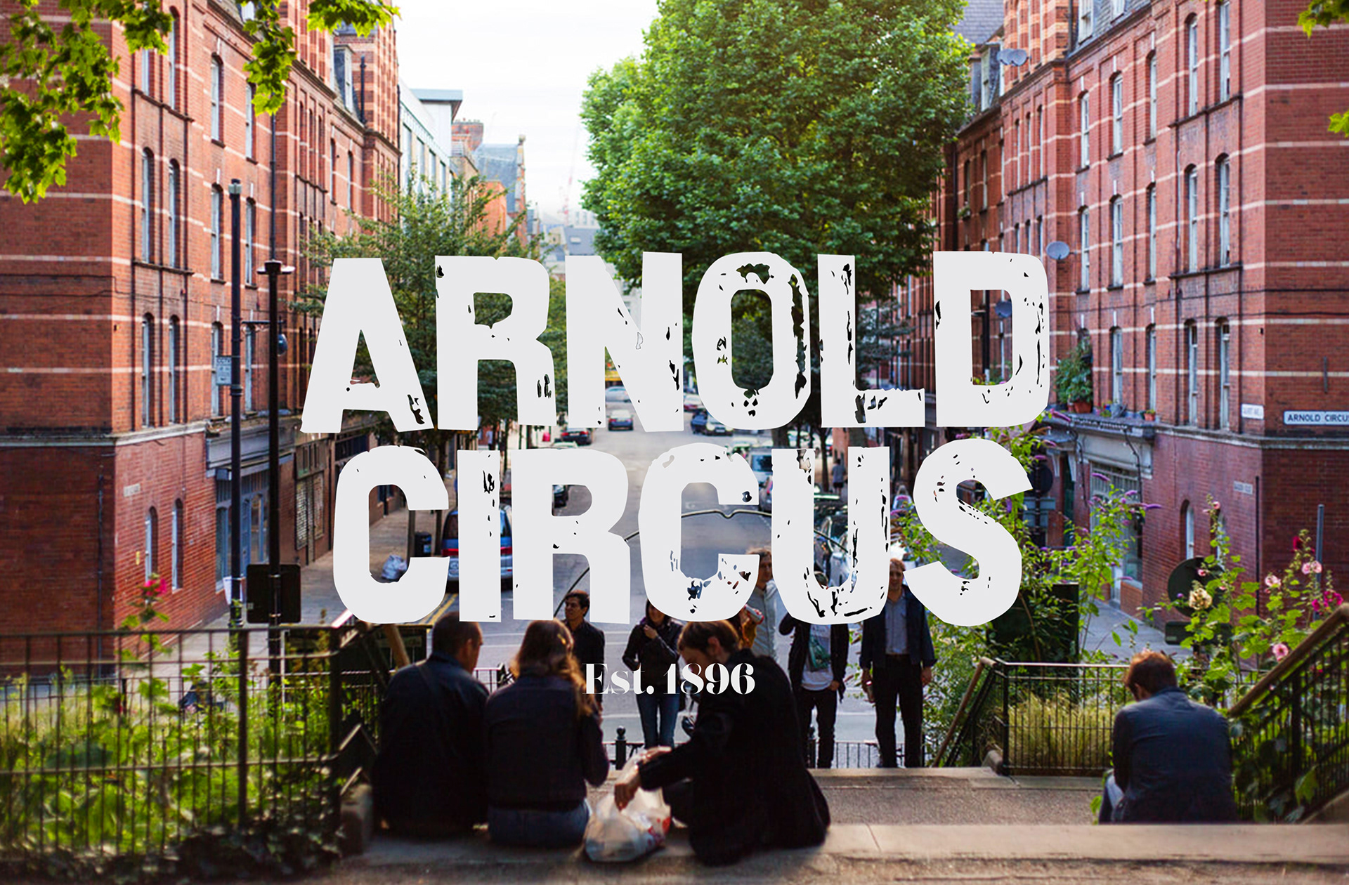
Place-maker branding. There's a lot of it about nowadays. And very often they have the most generic and dull aesthetics, created by agencies that might as well be the automated logo makers on Wix - they could be applied to anything because they bare no real connection to the place they are pinned on. When I was set a Place-maker task during my first year at uni, the one thing I wanted was to make sure it had an individual identity. One that really connected with the place, the people, and could somehow tell the story it had to tell. This is why when I was given Arnold Circus - one of the first and most iconic housing estates in England - I was overjoyed by it's hotchpotch of history, darkness, and light. With it's stunning red-brick buildings, towering over the beautiful central gardens, Arnold Circus was and still is, an estate like no other.
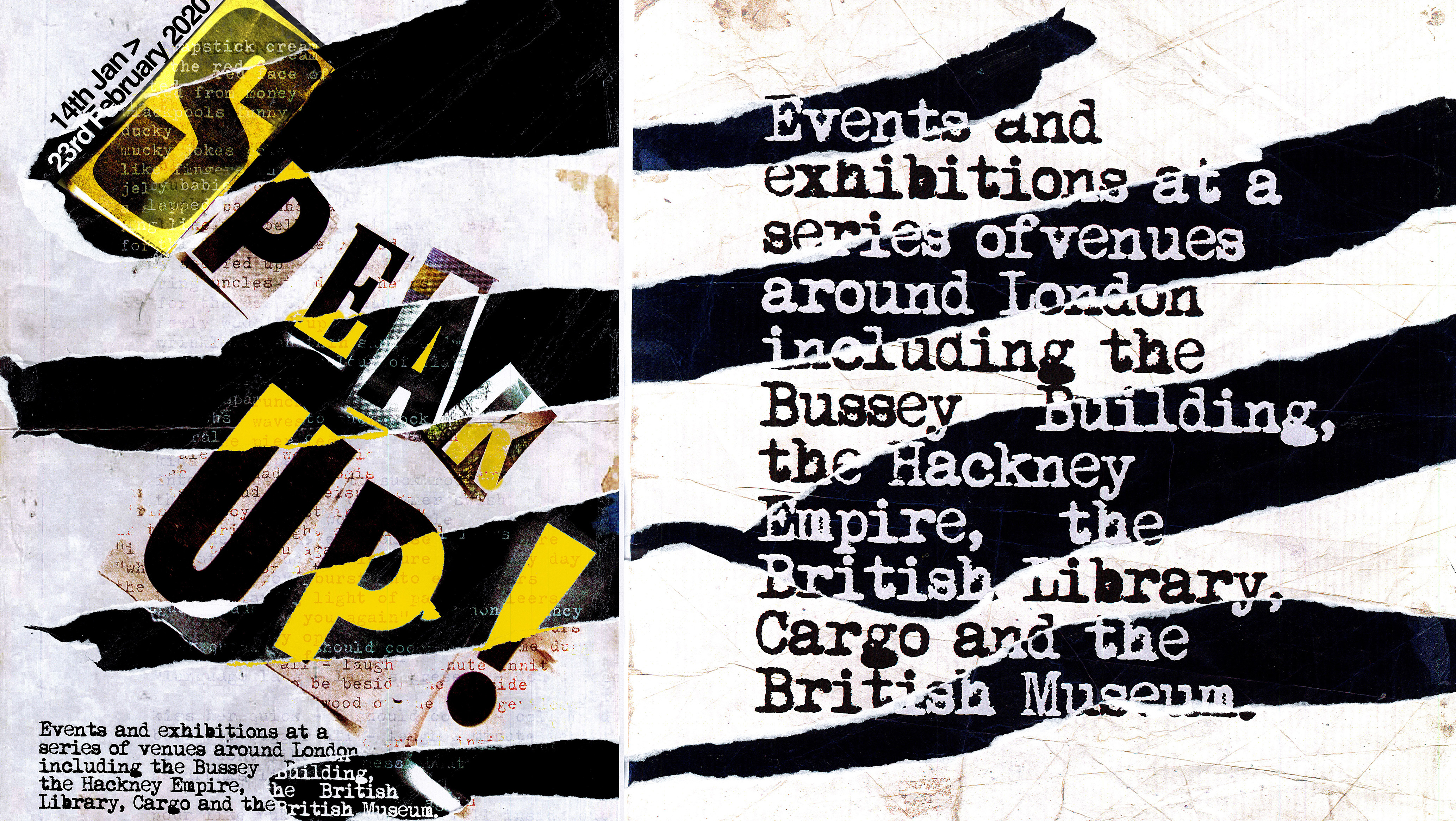
Arnold Bold typeface
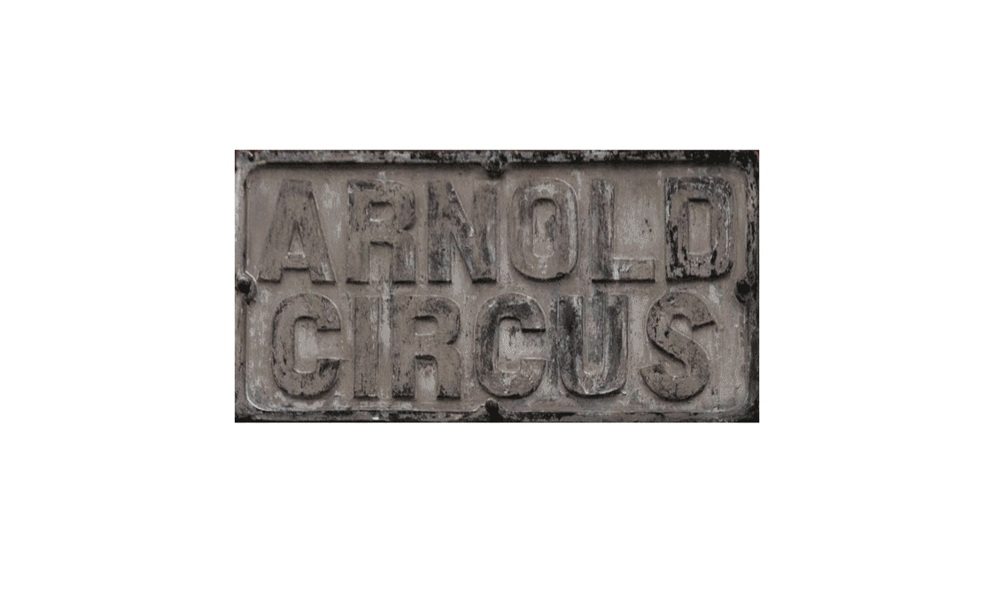
For this project I wanted to make sure the typeface held a direct connection with the Circus's story, which is why I used the original type used on the signage for the estate. The hidden beauty is the way it really encompasses the feeling of the estate. That initial feeling of grandeur and beauty, but with the dirt, scratches and marks taken directly from it's rough and complex history. For the accompanying typeface, I wanted something that reflected the traditional, yet quirky style of the architecture, which is why I chose Lust Display - a traditional looking Serif typeface with ornamentations that make it feel quite individual.
As well as the promotional video, I designed a fully functioning mockup of the Arnold Circus website using the design guidelines I set out for my branding.